DATA VISUALIZATION AND ANALYSIS TOOLS
- VIZUALIZE YOUR DATA
- USER GUIDE
- DEMO
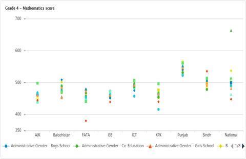
- A dot plot displays multiple points on one axis and categories or cross-classifications along the other axis. A dot plot is a good alternative to a table for displaying multiple categories or cross-classifications of data. Data values can be more easily compared in a dot plot than in a table.
- Example: out-of-school rate by country, sex, location, income group and other characteristics.
Coming soon
- VIZUALIZE YOUR DATA
- USER GUIDE
- DEMO
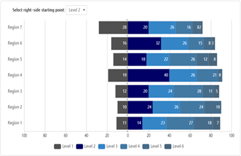
- Stacked charts use bars to show comparisons between categories of data, but with ability to break down and compare parts of a whole.
- Example: show learning levels by grade and region.
Coming soon
- VIZUALIZE YOUR DATA
- USER GUIDE
- DEMO
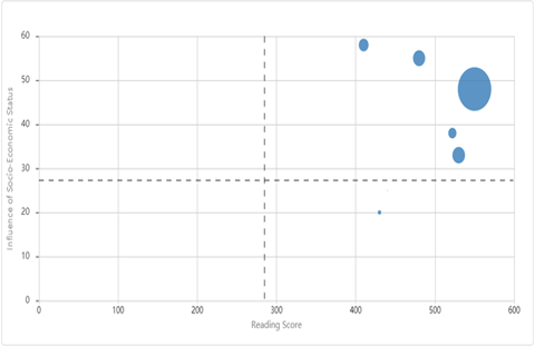
- Use to represent more than two data dimensions, use a bubble chart. Normally, you plot two data points on an X-Y axis plane with one indicator on the X-axis and the other on the Y-axis, and each data point is a bubble that varies by the size of the third indicator.
- Example: compare country GNP per capita (x-axis) and the rate of out-of-school children of primary school age (y-axis), with the bubble size reflecting the number of out-of-school children.
Coming soon